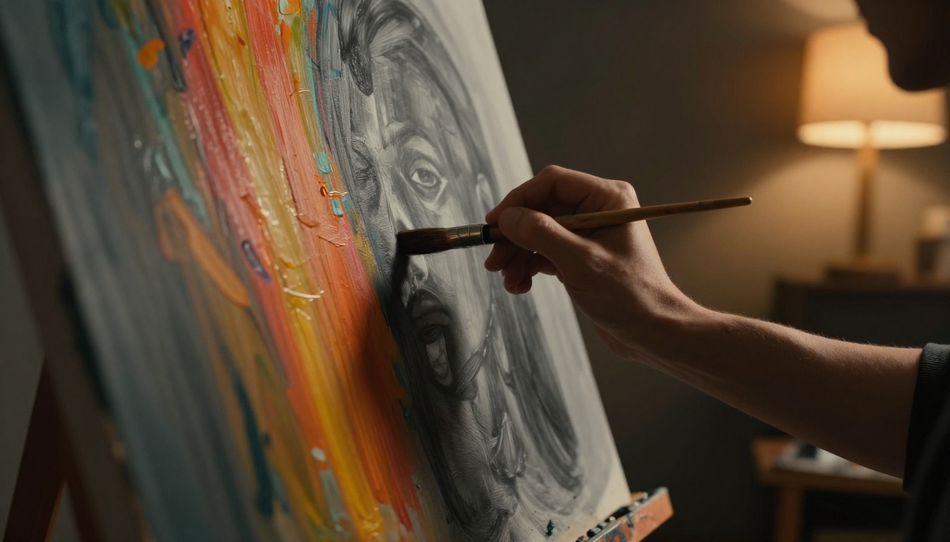
Picture this. You spend hours mixing vibrant colors on your canvas. You step back, excited to see your painting come alive. Instead, it looks flat, like a postcard under dull light. Colors alone don’t create that wow factor. Values do.
Values mean the lightness or darkness in your art. They stand apart from hue and saturation. Think black to white shades. Poor values make even bright reds and blues fall flat. Artists chase depth and drama, yet many miss this key step.
The fix? A simple grayscale check. This science-backed trick strips color away. It reveals value problems early. Your art gains dimension, contrast, and punch. You will learn why values rule perception. Plus, get step-by-step ways to use this check. Real examples show the transformation. Ready to make your work pop? Let’s start with the basics.
Unlocking the Science of Values: Light, Dark, and Why They Matter
Our eyes judge art through values first. They range from pure black to pure white. Hue adds color later. Saturation boosts intensity. Values create the foundation.
Science explains it. Cone cells handle color. Rod cells detect light and dark. Strong contrasts fool your brain into seeing form. A mountain under sunlight shows this. Highlights gleam white. Shadows plunge deep. The result? It feels three-dimensional.
Gestalt principles back this up. Your mind groups lights and darks into shapes. Balanced values build harmony. They guide the eye through the piece. Weak ones bore viewers.
Test it yourself. Squint at Monet’s water lilies. Colors fade. Values emerge strong. Dark greens push back. Light blues advance. This quick check proves values drive impact.
In short, master values. Your art shifts from flat to alive.
How Poor Values Flatten Your Art (And What Good Ones Do)
Flat art stems from midtones everywhere. Muddy grays dominate. No pure blacks or whites. Viewers glaze over.
Good values span the scale. High contrast grabs eyes instantly. Color follows. A grayscale photo pops more than a low-contrast colorful one. Brains crave drama from shadows and highlights.
Consider a portrait. Weak shadows blend skin into background. Strong ones carve cheeks and eyes. Depth appears. Psychology plays in. Humans notice edges and extremes first. Therefore, push values hard.
The Role of Local vs. Global Values in Realistic Art
Local values live on single objects. A apple’s highlight shines bright. Its shadow darkens.
Global values set the scene. Overall light wraps everything. Harmony comes when both align. Check thumbnails at small size. Values should read clear.
For example, in a forest, leaves have local darks. But global dusk tones them down. Balance prevents chaos. As a result, realism shines.
Why Colors Trick You: Enter the Grayscale Check
Colors fool artists. Saturated reds look dark. Bright yellows seem light. Your brain mixes them wrong.
Grayscale cuts the trick. Desaturate to see true values. It isolates luminance, like vision’s core channel. Fixes come faster. Colors build on solid ground later.
Beginners love this. No guesswork. Just truth on screen or paper.
The Eye Science Behind Why This Check Works Wonders
Color confuses judgment. Grayscale reveals reality fast. Munsell system sorts this. It separates value from hue.
Analogy fits. Turn off TV color. Signal strength shows clear. Weak values hide in color noise. Grayscale exposes them. Eyes adjust to pure tones. Adjustments feel right.
Most importantly, it saves time. Paint bold, check quick.
Your Foolproof Guide to Running a Grayscale Check
Start simple. Finish with pop. Follow these steps for any medium.
First, create your colorful piece. Block in shapes and hues. Don’t obsess over perfection yet.
Next, make a copy. Digital or traditional. Shrink to 50% size. This shows big-picture values.
Then, desaturate. Go full grayscale. Study the result. Too many mid-grays? Push blacks darker, whites brighter.
Adjust originals based on the check. Add contrast where needed. Reintroduce color stronger.
Repeat often. Early catches prevent rework. In addition, it builds value instinct over time.
Digital Tools That Make It a Breeze
Photoshop shines here. Duplicate your layer. Go to Image, Adjustments, Desaturate. Set the grayscale layer to Overlay blend mode. Toggle visibility for before-after.
GIMP works free. Colors, Desaturate. Same overlay trick.
Procreate users? Use Hue, Saturation, Lightness slider. Zero saturation. Assign a hotkey for speed.
Apps like Infinite Painter offer one-tap. Practice flows smooth.
Traditional Hacks for Canvas and Paper Artists
No computer? Use your phone. Snap a photo. Switch to black-and-white filter. Instant check.
Red acetate sheets block midtones. Hold over your art. Lights and darks pop.
Squint hard. Blur edges halfway. Tones simplify. Or photocopy in grayscale.
Value finders clip on. They measure steps from light to dark. Cheap and portable.
Before-and-After Magic: See Grayscale Checks Transform Art
Imagine a portrait. Skin tones glow warm. But cheeks lack form. Grayscale shows mushy mid-grays. No deep shadows under eyes.
Fix it. Darken hollows to near-black. Lighten forehead highlights. Re-color. Now, face sculpts in light. Drama leaps out.
Try a landscape. Greens blend into sky blues. Flat mess. Grayscale reveals no extremes. Boost mountain shadows black. Cloud edges white. Depth rolls in. Viewer feels space.
Abstract piece next. Bold swatches clash dull. Check strips color. Values cluster middle. Spread them full range. Final version pulses energy.
Your turn. Pull up recent work. Run the check. Watch flat turn fierce.
Pitfalls to Dodge for Values That Always Shine
Artists trip often. Ignore ambient light first. It mutes globals. Solution? Note light source early.
Over-rely on outlines next. Lines fake edges. Values build real form. Soften with tone.
Equal values everywhere bores. Vary them. Highs and lows create rhythm.
Fear pure black or white? Most scenes need them. Test in thumbnails.
Finally, skip thumbnails. Big canvas hides issues. Small views lie not.
Practice turns these fixes habit. Art shines consistent.
Quick Fixes for the Most Stubborn Value Problems
Midtone overload plagues many. Map three to five steps. Light, mid-light, mid, mid-dark, dark.
Edge lights wrong? Soften transitions with airbrush or dry brush. Blend natural.
Tie to color harmony. Strong values hold any palette. Grayscale first, then hue.
Grayscale demystifies values. Your art hits pro level fast. Every master relied on this. You can too.
Grab a piece now. Run the check. Tweak those values. Share your before-after in comments below. What popped most? Next, explore color temperature for even more punch. Paint bold. Your best work awaits.