Picture this: you hand out a business card at a big networking event. The recipient squints at the blurry logo and tosses it aside. Or worse, your Instagram post features a pixelated image that gets zero likes. These mishaps happen because of one key setting: DPI, or dots per inch.
DPI measures how many dots fit into one inch of your image. Printers use it to place ink dots for sharp results. Screens rely on pixels per inch, or PPI, but people often swap the terms. The catch? Print needs high numbers for close-up clarity, while digital works fine with lower ones since you view screens from farther away.
You might wonder why your print looks crisp yet your website image turns fuzzy. This guide fixes that. You’ll learn the basics, ideal settings for print like flyers and books, smart choices for web and high-res screens, key differences between mediums, and handy tools. Whether you’re a beginner designer or a seasoned pro, these steps help you pick DPI settings that deliver pro results every time. Let’s dive in and match DPI to your project.
What DPI Means and Why It Controls Your Image Quality
DPI stands for dots per inch. Printers lay down that many ink dots per inch to build your image. Screens use PPI, pixels per inch, instead. Yet designers often call both DPI for simplicity.
Higher numbers pack more dots or pixels into the same space. This creates smoother edges and finer details. For example, a 72 DPI image looks blocky up close. Bump it to 300 DPI, and lines sharpen right up.
Viewing distance changes everything. You hold print close, like a book six inches from your eyes. So it demands higher DPI. Screens sit two feet away on average. Lower PPI still looks good because backlighting makes pixels glow bright.
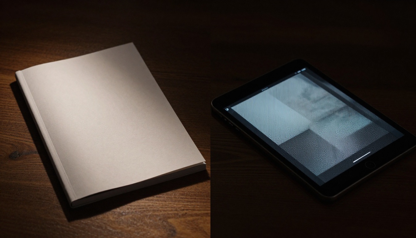
Think of it like photos in a newspaper versus a glossy magazine. Newspapers use rough, low-res dots from far away. Magazines cram in tiny, high-res dots for close inspection. Software like Photoshop shows DPI in the image size dialog. It lists pixels, width in inches, and resolution.
Back in the day, web images stuck to 72 DPI. Monitors had low density. Now, phones pack 400 PPI or more. Still, base rules hold: match resolution to how people see it.
Resolution ties to file size too. More dots mean bigger files. This slows web loads but boosts print quality. Always check your output medium first. In short, DPI controls detail density. Pick wrong, and your work falls flat.
Software measures in pixels total. Divide by inches for DPI. A 1000×1000 pixel image at 10 inches wide equals 100 DPI. Simple math guides your choices.
Perfect DPI Settings for Print Projects That Impress
Print demands precision because ink soaks into paper. High DPI ensures crisp text and photos. Most jobs need 300 DPI. This standard works for flyers, posters, and brochures viewed from about 12 inches away.
Paper type matters. Glossy stock reflects light, so it forgives slight drops. Matte absorbs more ink. It needs full 300 DPI to avoid muddiness. Always add bleed, that extra half-inch border. Set images at full size with bleed to keep resolution steady.
Create in Photoshop or Illustrator from the start. Go to Image > Image Size. Lock pixels and set 300 DPI. Upscaling low-res files blurs details. It never truly fixes poor originals.
Budget time for proofs. Local print shops offer cheap tests. Spot issues before a full run.
Standard DPI for Flyers, Business Cards, and Books
Stick to 300 DPI for close-view items. Business cards shine at this level. Text pops, and colors stay true.
Books follow suit. Interiors use 300 DPI for readable pages. Covers might go 300 to 600 DPI for extra punch under store lights.
Check in software easily. Photoshop’s Image Size shows it. Preview at 100% zoom. If edges look jagged, boost DPI before export.
Flyers match this rule. A 300 DPI file at full size prints sharp from arm’s length.
When Large Format Prints Need Lower DPI
Big prints change the game. Banners over three feet wide use 150 DPI. Viewers stand back 10 feet or more. Detail holds without waste.
Calculate it quick. Take print width in feet times 30. That gives pixels needed. A 10-foot banner at 150 DPI needs 1800 pixels wide.
Posters follow similar math. Trade shows view from five feet, so 150 DPI fits. Save ink and time on huge files.
Test distance in your shop. Hold a proof far back. Adjust if needed.
Best DPI Choices for Digital Displays and Web That Shine Everywhere
Digital flips the script. Screens use 72 to 96 PPI as baseline. Pixels glow, and you sit farther back. High numbers bloat files and slow sites.
Web compresses images anyway. Start at 72 PPI for fast loads. Social platforms like Instagram resize to 1080 pixels wide max.
Modern screens pack density. Phones hit 300 PPI plus. Yet one optimized file scales across devices. Responsive design handles the rest.
Export smart. PNG suits graphics with transparency. JPEG works for photos. Test on phone, tablet, and desktop.
File size boosts SEO. Google favors quick sites. Low PPI keeps you speedy.
Web and Social Media Images at 72-96 PPI
Low PPI shines online. Algorithms upscale as needed. Instagram downsizes big files, so match their specs.
Smaller files load in seconds. This cuts bounce rates. Use 72 PPI for posts and headers.
Email newsletters follow suit. 96 PPI max keeps inboxes happy.
Handling High-Density Screens Like Retina and 4K
Retina demands more. Create @2x images, double the pixels. A 1000×1000 base at 72 PPI becomes 2000×2000.
CSS srcset serves the right size. Phones grab high-res versions automatically.
4K TVs use lower PPI from couch distance. Stick to 72 base. Zoom tests confirm sharpness.
Print vs Digital DPI Face-Off: Spot the Differences and Choose Wisely
Print and digital clash on basics. Here’s a quick comparison:
| Aspect | Digital | |
|---|---|---|
| Standard DPI | 300 DPI | 72-96 PPI |
| Viewing Distance | Close (6-12 inches) | Far (2+ feet) |
| File Impact | Bigger files, longer print times | Small files, fast loads |
| Key Factor | Ink absorption, paper type | Screen glow, compression |
| Best For | Flyers, books | Web, social media |
Print guzzles high DPI for detail. Digital thrives light because pixels pop.
Take one photo. Export at 300 DPI for a brochure. It prints crisp. Same file at 72 PPI loads zippy on your site.
High DPI hurts web SEO. Sites crawl slow. Print shops charge more for huge files.
Hybrids exist. PDFs hold both settings. Specify print or screen intent.
Ask first: does it print or display? Factor budget and audience devices. Logo designers workflow: create at 300 DPI master. Export versions per use.
This tree saves headaches every project.
Tools and Quick Checks to Pick DPI Without Guesswork
Free tools make it easy. Photoshop’s Image Size dialog shows all. Tick Resample off to check true DPI.
GIMP offers the same. Scale Image menu lists pixels and inches.
Online resizers like Squoosh handle quick jobs. Upload, set DPI, download.
Print calculators predict scale. Enter size and distance for target DPI.
Proof prints catch errors. Shops charge little for samples.
For screens, browser dev tools zoom to 200%. Emulators mimic phones.
Checklist: set DPI at creation. Work in pixels always. Export per medium last.
Shortcuts speed it up. Photoshop Cmd+Option+I opens size dialog. Pro habit: vector masters scale forever.
Nail Your Next Project with Smart DPI Choices
Print craves 300 DPI for that close-up wow. Digital hums at 72-144 PPI for speed across screens.
Match settings to medium and distance. You’ll dodge blurs and slow loads every time.
Audit old files now. Test a fresh export on real devices and paper. Share your wins below. What DPI mix-up bit you hardest?
Grab our free cheat sheet for quick reference. Subscribe for more design fixes. Now create images that stun on page and screen.