Picture this: you’re crafting an app icon that pops on your phone screen. It looks crisp and detailed at 512 pixels wide. But drop it into a website favicon, and it blurs into a pixelated mess. Blow it up for a poster, and those edges turn rough and uneven.
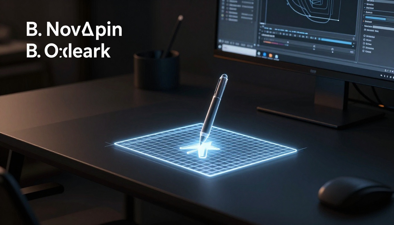
Raster images fail you here because they rely on fixed pixels. You need something better. That’s where vector pens come in. These are the powerful Pen tools built into apps like Adobe Illustrator, Affinity Designer, or the free Inkscape. They let you draw smooth, precise paths that define shapes mathematically.
So, your icons stay razor-sharp no matter the size. They scale from tiny buttons to massive banners without a hitch. Plus, you gain perfect symmetry every time. No more tweaking crooked lines by hand.
Most designers struggle with this early on. They waste hours redrawing or using clunky shapes. But vector pens fix that fast. You’ll build balanced icons that enhance your UI and grab attention.
Here’s the good news. This guide walks beginners through it step by step. You’ll set up your software, master basic strokes, and create symmetrical designs in minutes. As a result, you save time on revisions and deliver pro results.
Icons like these boost user appeal right away. Think cleaner apps, sharper logos, and happier clients. In addition, they load quicker in designs because vectors are lightweight.
Ready to draw your first perfect icon? Let’s jump into picking the right tool and starting simple.
Understand Why Vector Pens Beat Other Tools for Icons
Vector pens outshine brushes or shape tools because they create icons that resize without flaws. Raster brushes build pixel grids. Those grids blur when you enlarge them. In contrast, vector pens draw math-based paths. These paths stay sharp from app icons to billboards.
Think of paths as rubber bands stretched between pins. You place pins, called anchor points, then pull handles to curve the band. That’s a simple bezier curve. For example, draw a leaf icon: start with two anchors at the tip and base. Pull handles outward for a smooth arc. No pixels mean zero quality loss at any zoom.
You need scalable icons now more than ever. Mobile screens vary wildly. Websites demand crisp logos at all sizes. By 2026, most traffic hits from phones. Vector icons load fast and look pro everywhere. Plus, symmetry comes easy. Mirror one side, and the rest balances perfectly. No endless nudges.
Real-world wins show up in app stores or web UIs. A heart icon scales from 16×16 pixels to full-screen without jaggies. Clients love that polish. So, vector pens save hours and boost your designs.
Vector Paths Explained: The Secret to Endless Scalability
Anchor points act as corners or ends. Handles extend from them like levers. You drag handles to bend paths smoothly. Picture a straight line between two anchors. Pull a handle, and it forms a gentle wave, perfect for that leaf curve.
Paths connect these points into closed shapes. Fill them for solid icons or stroke for outlines. Because software calculates them with math, zoom in forever. No blurry edges like raster drawings.
Test it yourself. Draw a quick circle in Illustrator or Inkscape. Hit 5000% zoom. Edges stay crisp. Then, resize to 10 pixels wide. Still perfect. That tip alone proves why vectors rule for icons.
Symmetry Made Simple: Balance Every Stroke
Symmetry grids divide your canvas. Lines snap your pen strokes to exact mirrors. Reflect tools copy one half across the grid. Boom, instant balance.
Take a heart icon. Draw the right lobe with the pen. Activate reflect over a vertical guide. The left side flips perfectly. Handles snap too, so curves match dead-on.
This beats manual copying and tweaking. You finish in seconds, not minutes. Guides ensure alignment every time. As a result, your icons feel pro and balanced fast.
Set Up Your Workspace for Icon Perfection
You want your vector pen strokes to snap into place every time. A solid workspace setup makes that happen. Start with the right software and tweak key settings. This way, symmetry builds in from the first line. You’ll draw faster and avoid common headaches.
Pick the Right Software and Customize Settings
Choose tools that handle vector pens well. Adobe Illustrator suits pros with deep controls. Figma works great for teams because it shares files easily. Inkscape offers a free option that packs pro features. Affinity Designer rounds out the list as a one-time buy.
Here’s a quick look at why they shine:
- Adobe Illustrator: Top precision for complex icons; integrates with Photoshop seamlessly.
- Figma: Cloud-based collaboration; perfect if you work with others remotely.
- Inkscape: Completely free and open-source; no subscription needed.
- Affinity Designer: Affordable forever license; fast performance on any machine.
Pick Illustrator or Inkscape to start. They give you full pen control without barriers. Next, set up your canvas right. Go for a 512×512 pixel artboard. That size matches app icons perfectly. It scales down or up without issues.
Use RGB color mode for web icons. It keeps colors vibrant on screens. Avoid CMYK unless you print.
Now, customize for symmetry and speed. Follow these steps in your chosen tool:
- Enable smart guides and grids. In Illustrator, hit Cmd + U (Mac) or Ctrl + U (Windows). They snap your pen to perfect lines. Turn on the grid via View > Show Grid. Set it to 24×24 units for icon work. Inkscape does the same under View > Snap Grids.
- Tweak pen tool options. Select the Pen tool (P key). In Illustrator’s toolbar, check Rubber Band mode. It previews your next anchor as you drag. Set anchor display to show handles clearly. Choose stroke over fill first for outlines.
- Adjust stroke and fill panels. Open the Swatches panel. Set stroke to 2-4 pt weight. Pick no fill until your shape closes. This keeps things clean. In Inkscape, use the Fill and Stroke dialog (Shift + Ctrl + F).
- Set up symmetry guides. Draw a vertical guide at the center (drag from ruler). Lock it in place. Enable Snap to Guides. Your pen paths mirror across it easily.
Picture the toolbar like this: Pen icon active, rubber band on, stroke panel open with a thin black line selected, grid faint in the background. Anchors glow blue on hover.
Test it now. Draw a straight line. Watch it snap to the grid. Add a curve. Handles preview smooth. Shortcuts like V for Select or A for Direct Selection speed you up.
Free tools like Inkscape match paid ones here. You lose nothing on basics. As a result, your icons start symmetrical from stroke one. Setup takes five minutes but pays off big.
Draw Symmetrical Icons Step by Step
Your workspace hums with potential. Grids snap, guides align, and the pen tool waits. Now, grab it to build a symmetrical star icon. This simple project shows vector pens in action. You’ll sketch one side, mirror it, and refine for perfection. Follow along, and soon you’ll craft any icon with ease. Practice builds speed, so repeat this a few times.
Start with Guides and Sketch Your Base Shape
First, draw your grid and guides. In Illustrator or Inkscape, show the grid with Ctrl + ‘ (Windows) or Cmd + ‘ (Mac). Set it to 24 units for tight control. Drag a vertical guide to the canvas center from the ruler. Add horizontal ones at top and bottom for bounds. These lines force symmetry from the start.
Pick the Pen tool (P). Hold Shift for straight lines. Click to place your first anchor at the star’s top point, right on the vertical guide. Next, click down and left for the upper arm, Shift for straight. Alt-click (Option on Mac) the last anchor to convert it. This frees handles for curves later.
Continue around one half. Aim for five points: top, upper left, lower left, bottom, then back up. Keep strokes under the guides. Close the path by clicking the first anchor. A small circle appears when it snaps shut. Your base half looks rough, but that’s okay. It gives a solid outline.
Troubleshoot early. Stray points? Select with Direct Selection (A), then Delete. Too many anchors? The pen adds them automatically, so plan clicks.
Mirror and Refine for True Symmetry
Select your half-star path. Use the Reflect tool (O in Illustrator; in Inkscape, use Object > Transform > Reflect). Click the vertical guide as the axis, then drag to flip right. Hold Alt to copy instead of move. Now both halves align perfectly.
Union them with Pathfinder. In Illustrator, select both, then Window > Pathfinder > Unite. Inkscape users go to Path > Union. This merges into one clean shape. Compare before and after: the left side wobbled before; now it matches dead-on.
Refine curves next. Switch to Direct Selection (A). Drag handles on anchors for smooth points. Pull outward for sharp tips, inward for gentle arcs. Test symmetry by nudging one; the mirror follows if guides snap. Add subtle curves to arms for a modern look.
Here’s the numbered process for your star:
- Sketch right half with Shift-straight lines and Alt-anchors.
- Reflect across vertical guide.
- Unite paths.
- Adjust handles evenly.
You control every bend. Feel capable yet? One practice run locks this in.
Test Scale and Export Clean Files
Zoom to 6400% with Ctrl + + (Cmd + + on Mac). Check edges: smooth? Paths simplify if needed. Select all (Ctrl + A), then Object > Path > Simplify. Reduce points without losing shape. Star tips stay crisp.
Scale test follows. Duplicate the icon. Resize one to 32×32 pixels, another to 2048×2048. Vectors hold sharp lines at all sizes. No blur, no jaggies.
Export as SVG for true scalability. File > Export > Export As > SVG. Check “Use Artboards” and “Responsive” for web use. Clients love these lightweight files.
For PNG fallback, export at 512×512. Use Transparent background. Quick tip: Batch export multiples via Asset Export panel in Illustrator.
Variations keep it fun. Turn the star into an arrow: elongate points, mirror horizontally. Or a badge: add inner curves, reflect radially. Practice on a leaf next, with wavy handles. Muscle memory kicks in fast. Your icons scale anywhere now. Go build that portfolio piece.
Level Up with Pro Tips and Fixes
You’ve nailed the basics with your star icon. Now push further. Pro tips turn good icons into standout pieces. For example, create pattern brushes for repeating details like scales on a fish icon. Draw a small motif, then apply it along a path. Your designs gain complexity without extra work. In addition, build reusable symbols in Illustrator or Inkscape. Drag one from the panel, tweak colors, and reuse across projects. This saves hours on UI sets.
Optimize paths for speed too. Too many anchors slow renders. Use Object > Path > Simplify to cut them down. Your SVGs load faster on websites. Pick modern color palettes next. Go for duotone schemes like deep blue and neon pink. They pop on dark modes. Test with tools like Coolors for quick picks.
Look ahead to 2026 trends. Neumorphism mixes vectors with soft shadows and subtle extrusions. Add inner glows via Appearance panel. Stack paths for depth. Clients demand this fresh look. Experiment freely. Swap your star for a leaf or gear. Mix radial symmetry. Soon, your portfolio shines with custom sets: app suites, logo packs, even animated icons via Lottie exports.
These tricks build confidence. You create pro work that scales anywhere.
Avoid These Icon-Killing Errors
New drawers hit snags that ruin symmetry. Spot them early, and fix fast. Here are five common pitfalls, plus quick remedies.
First, uneven handles distort curves. One side bulges while the other flattens. Solution: Select anchors with Direct Selection (A). Match handle lengths by eye or Align panel. Drag symmetrically across your guide.
Second, open paths leave gaps. Fills fail, and strokes look broken. Always close shapes. Hover over the first anchor; a circle shows. Click to seal it. Check with Outline view (Ctrl + Y).
Third, too many anchors create lumps. Paths wobble from excess points. Delete extras: Select (A), hit Delete. Then unite segments via Pathfinder. Smooth joins instantly.
Fourth, ignore stroke alignment. Centers default, but edges clip on curves. Switch to outer alignment in Stroke panel. Your outlines stay crisp at small sizes.
Fifth, unsnapped paths drift off guides. No symmetry follows. Turn on Snap to Grid (View menu). Hold Shift for straights. Paths lock in place every time.
Catch these, and your icons stay clean. Practice on scraps first. Results improve right away.
Conclusion
Vector pens deliver perfect symmetry and endless scalability for your icons. You set up grids and guides first. Then sketch one side, reflect it, and refine paths. As a result, shapes stay sharp from tiny favicons to huge banners. No more pixel blur or uneven lines.
Open your software today. Grab the pen tool and draw a simple star or leaf. You’ll see results right away because these steps build pro icons fast. In addition, test scales and export SVGs for real use.
Share your first icon in the comments below. Subscribe for more tips on UI designs and trends. Check free icon packs on sites like Flaticon to remix and practice. You’re ready to create standout work now.