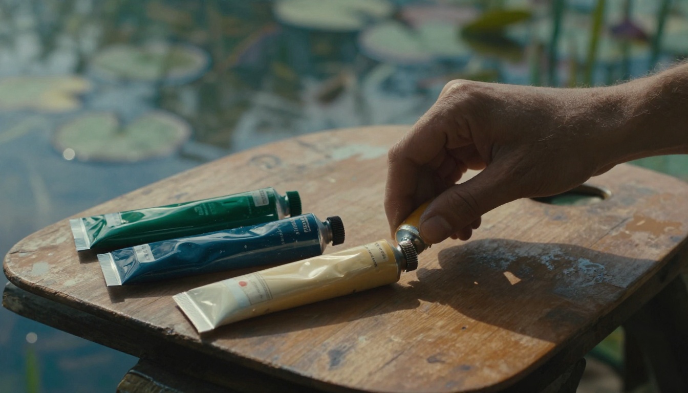
Picture Monet’s water lilies. He captured that dreamy pond with just a handful of greens and blues. Those few colors create perfect unity, pulling you right into the scene.
You want that same magic in your art, right? A limited color palette means picking 4 to 8 colors that harmonize perfectly. It solves the chaos of grabbing every tube of paint on your shelf.
This approach makes choices easier while you paint. Your pieces gain a pro look that ties them together across your portfolio. Plus, it amps up the emotional pull, so viewers connect deeper.
In this post, we’ll walk through the step-by-step process. You’ll learn how to select colors, test them, and refine your palette for any style.
Ready to make your art feel like one big family?
See Why Limited Palettes Make Your Art Style Shine
Limited palettes create harmony in your art, just like a band sticks to a few chords for a tight sound. Every color pulls its weight. Nothing clashes. As a result, your pieces flow with purpose and grab attention.
Think of your colors as a small wardrobe. You mix and match outfits easily because everything coordinates. A chaotic palette, on the other hand, feels like a closet explosion: shirts clash with pants, patterns fight, and nothing looks right. Now picture the opposite. A unified palette turns that mess into a sharp, signature look. Viewers remember it because it sticks.
Henri Matisse mastered this. He often used just reds, blues, and greens in his cut-outs. Those choices built bold energy without distraction. In short, your style emerges stronger.
You make quicker decisions too. No hunting through dozens of hues mid-stroke. Less overwhelm means more flow in your process. Besides, a consistent palette builds your personal brand across sketches, paintings, or digital work. Fans spot your vibe instantly.
Compare it to room decor. A few matching tones make a space cozy and intentional. Add random splashes, and it turns cluttered. Your art does the same. One example: a landscape with wild rainbow skies looks frantic. Swap to earthy browns and soft yellows, and peace settles in.
Another quick case. Portrait artists limit to skin tones, one shadow blue, and a highlight peach. Faces pop with life. Viewers connect deeper because emotions hit clear.
Most importantly, this approach saves time. You finish pieces faster and refine your voice. So, your portfolio shines as one cohesive family.
Boost Mood and Focus in Your Creative Process
Few colors steer emotions with precision. Cool blues and greens calm viewers, like a quiet lake at dusk. Warm oranges and reds spark energy, pulling eyes to the action.
You guide feelings on purpose. Pick a palette, and the mood sets itself. Artists swear by it. Pablo Picasso once said, “Colors, like features, follow the changes of the emotions.” Simple studies back this. People rate cool-toned art as serene, while warms feel vibrant.
Your workflow speeds up too. Fewer options cut decision fatigue. You grab the right brush without pause. In addition, focus sharpens. Ideas flow because you stay in the zone.
Start with mood in mind. Need calm? Build around teal and gray. Energy calls for crimson accents. Test it next session. You’ll paint longer and love the results.
Pick Your 3-5 Foundation Colors That Click
You start here with the core of your palette: 3 to 5 colors that work together from the start. Pick them for harmony, not random grabs. Begin with one favorite color that matches your mood. Does your art need calm energy? Go analogous colors next to it on the color wheel, like blues fading into greens for smooth flow. Want some pop? Grab a split complementary pair, such as orange with teal and blue-green. These sit close but contrast just enough.
First, choose your primary color. Make it bold, the star that sets the tone. Then add 2-3 secondary colors to support it. They fill gaps without fighting. For example, pair a warm yellow primary with soft ochre and sage green secondaries. Test mixes on scrap paper right away. Free tools like Coolors or Adobe Color help generate options fast; just input your primary and tweak.
In short, build step by step. Start small. Your foundation stays strong because every pick pulls from purpose.
Hunt Inspiration in Everyday Scenes
Look around you for real-world clues. Snap photos of sunsets with their pink-to-orange fades. Capture old brick buildings in deep reds and weathered grays. Even a bowl of fruits offers gems: lemons for bright yellows, berries for juicy purples.
Extract those hues easily. Open your phone’s photo editor and use the color picker tool. Apps like Adobe Capture pull exact swatches in seconds. Or squint your eyes at the scene. Shapes blur, and colors simplify into 3-5 basics.
Take a rusty truck, for instance. It gives earthy tones: burnt orange, muddy brown, and steel blue. Perfect for gritty landscapes. Forests yield deep greens, bark browns, and sky accents. These natural sets harmonize because nature does it best. Grab your phone today. Hunt one scene per project. Your palette gains life from what you see.
Match Colors to Your Art’s Vibe
Now align those colors to your piece’s feel. Fantasy art thrives on mystical purples, midnight blues, and gold highlights. They build wonder without chaos. Portraits call for soft neutrals like warm beiges, cool grays, and one rosy accent for cheeks.
Ask yourself key questions first. What mood do you chase: tense drama or quiet joy? What medium shapes it: oils for rich blends or digital for clean edges? Watercolors favor translucent washes, so pick high-chroma starts.
Street art might demand vibrant pops like electric lime and hot pink. Landscapes stick to muted earths for realism. Your genre guides the choices. Test a quick thumb sketch. If it sings, keep it. This step locks in cohesion early, so later tweaks build on a solid base.
Grow Your Palette with Smart Variations
Your 3-5 base colors form a solid start. Now expand them smartly. Add tints, shades, and tones to build depth. These variations come straight from your bases, so everything stays cohesive. Limit yourself to 2-3 per base. That keeps the palette tight at 4-8 total colors. Pick one bold accent for pop. Overmix, and colors turn muddy, so mix clean and test often.
This method adds breath without clutter. Your art gains layers, like sunlight filtering through leaves. Viewers feel the dimension.
Layer Neutrals for Balance and Breath
Neutrals act as glue in your palette. Blacks, whites, grays, and beiges hold bold colors together. They create balance and space. Start by tinting your bases with white for lighter versions. Add black for shades that deepen shadows. Mix in gray for tones that soften edges.
For example, take a base blue. Tint it pale for skies. Shade it navy for nights. Tone it slate for mist. Do the same with your other bases. Limit to 2-3 variations each. This approach ensures cohesion because every neutral ties back to your foundation.
Beiges work great as warm neutrals. Tint a base ochre into soft sand. Grays bridge cools and warms. However, watch pitfalls. Stark white overwhelms delicate hues; mute it with a base tint instead. Pure black muddies mixes; lighten it slightly. Off-base neutrals break harmony, so always derive them.
Accents add punch. Choose one bold color, like a vivid crimson from your warm base. Use it sparingly for highlights. It draws eyes without dominating.
Common mistake: endless mixing leads to mud. Clean your palette between tests. Wipe brushes. Your neutrals stay crisp as a result.
Spot Check for Perfect Harmony
Test your full palette before committing. Quick checks save rework. First, print swatches on paper. Hold them at arm’s length. Do they blend in real light?
Next, convert to grayscale. Open in Photoshop or a free app like GIMP. Neutrals should range from light to dark without gaps. Colors lose hue but keep value balance.
Follow the 60-30-10 rule for balance. Let your dominant color cover 60% of the space. Secondary takes 30%. Accent hits 10% for spark. Sketch a simple composition. Fill areas with each. Adjust if one overpowers.
Digital previews speed things up. Use Procreate or Krita. Layer swatches over a mock scene. Zoom out. Flip the canvas. Harmony jumps out, or flaws do.
Print again under different lights: daylight, lamp, phone screen. Colors shift, so versatile ones win. These steps confirm your palette sings together. Your art stays cohesive across any medium.
Test and Tweak Until It Feels Right
Your palette looks great on paper, but does it hold up in action? Test it now. Tweak based on what you see. This step turns good ideas into keepers. You avoid big regrets later. Plus, it builds confidence in your choices.
Preview in Your Favorite Medium
Match your tests to your tools. Traditional artists, scan your paint swatches into a digital file. Or lay out physical samples on your canvas. See how they sit together in real space.
Paper soaks up watercolor, so colors fade or shift. Test a quick wash first. Oils stay bold, but blends muddy fast; mix small dabs on scrap. Adjust brightness down because studio lights punch up hues.
Digital creators face screen glow. Colors pop too bright on monitors. Dial back saturation in your software. Export to PNG and view on phone or print. Does the vibe hold?
Paint small studies next. Fill a 5×7 inch page with your palette. Block in shapes like a mini landscape. Step back ten feet. Squint. Harmony shines or cracks show up. Traditional or digital, preview catches issues early. You save time on full pieces.
Refine Based on Real Results
Build full pieces with your palette. Track wins and flops in a notebook. Note which mixes sing, like a teal shadow on ochre skin. Jot saturation tweaks too. Drop it if a yellow overwhelms.
Swap colors into old work. Redraw a past sketch using new limits. Compare side by side. Feedback helps; show friends or online groups. They spot clashes you miss.
Iterate on failures. A muddy green? Lighten value next time. Too flat? Boost one accent. Keep logs simple: date, piece name, changes made, result. Over weeks, patterns emerge.
Stick to one palette for a series long-term. Van Gogh tweaked blues and yellows across starry nights, refining for mood. Matisse adjusted reds in cut-outs for bolder punch. Tools speed it: load swatches in Photoshop for layers, or save palettes in Procreate for brushes.
Experiment freely. Results guide you. Your art grows cohesive because you refine with purpose.
Conclusion
You now know the path: choose your base colors, add smart variations, and test them hard.
This builds a limited color palette that ties your art together, just like Monet’s water lilies pulled you into that serene pond.
As a result, your pieces gain that pro unity viewers love.
Your cohesive style awaits.
Pick three bases today and mix a quick study.
You’ll see the flow right away.
Share your palette in the comments below. What colors define your vibe?
Try it now, and subscribe for more art tips to keep your style sharp.