You’ve stared at hex codes or RGB sliders for ages, but the color still doesn’t match your vision. It happens to every designer tweaking logos or websites. That’s the pain of rigid number-crunching.
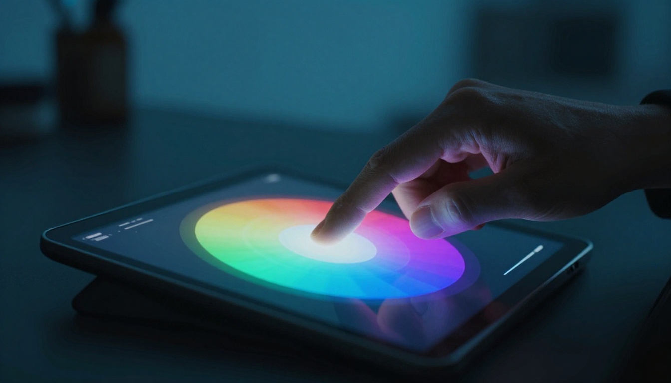
The HSB slider fixes it. HSB means Hue, Saturation, and Brightness. You adjust colors intuitively, like mixing paints on a palette, for better control than RGB ever offers.
First, grasp HSB basics. Then master access, usage, pro tips, and examples. You’ll pick spot-on colors with total confidence.
Break Down the HSB Color Model: Hue, Saturation, and Brightness Explained
The HSB color model, also called hue, saturation, and brightness, makes color picking feel natural. You select a base shade, tweak its punch, and adjust its glow, all with sliders. Unlike RGB, where you crunch numbers for red, green, and blue mixes, HSB lets you think like an artist. RGB demands math guesses; HSB gives you a visual playground.
Picture RGB sliders as lab beakers. You pour exact amounts and hope for gold. HSB sliders act like paint tubes. Squeeze for color, dilute for tone, brighten for shine. That’s why designers love it for quick, spot-on choices.
Sliders interact too. Crank saturation on a dim hue, and it pops. Drop brightness on a vivid one, and it softens. What happens when you slide all three? Colors shift in real time, so you see results instantly.
Here’s a simple comparison to spot the difference:
| Aspect | HSB Sliders | RGB Sliders |
|---|---|---|
| Control | Visual wheel and bars for intuition | Numeric values (0-255 each) |
| Hue | 0-360° color wheel | Mix R, G, B ratios |
| Saturation | 0-100% intensity | Indirect via component balance |
| Brightness | 0-100% light/dark | Overall RGB average |
| Best For | Creative tweaks, fast harmony | Precise web/print specs |
This table shows HSB’s edge for everyday use. Now, let’s break each part.
Hue: Spin the Color Wheel to Find Your Base Shade
Hue sets your starting color. Most pickers show it as an outer ring. Slide from 0° fiery red, past yellow at 60°, lime green at 120°, royal blue at 240°, and back to red at 360°. Small shifts create neighbor shades that blend well.
Start here to nail the mood. Warm hues energize; cool ones calm. Try this: open your picker, slide hue slowly, and watch the preview change. Notice how 10° jumps feel smooth?
Here are key hue ranges:
- Warm tones (0-60°): Reds and oranges spark excitement, perfect for calls-to-action.
- Yellow-greens (60-120°): Fresh and lively, great for nature themes.
- Cool blues (180-300°): Trustworthy and serene, ideal for backgrounds.
Because hue anchors everything, pick it first. Then saturation and brightness build from there.
Saturation: Dial Up the Intensity for Colors That Grab Attention
Saturation controls vividness with the saturation slider. At 0%, you get gray tones, no matter the hue. Push to 100%, and the pure color bursts alive.
Think of it like a faded photo versus a fresh print. Low saturation suits subtle backgrounds or text readability. High saturation makes accents pop, but watch out. Overdo it, and colors turn garish.
Pair it with hue for magic. High-sat orange (30°) screams energy. Low-sat version creates soft peach pastels. Try sliding it now in your tool. See how it drains or amps the life?
Designers use desaturated hues for calm interfaces. Meanwhile, vibrant ones draw eyes to buttons. Balance keeps your palette pro.
Brightness: Lighten or Darken Without Losing True Color
Brightness, sometimes called value, dims or lights your hue. Slide to 0% for black. Hit 100% for full glow.
It differs from lightness in HSL models. Here, you keep the hue pure while shifting tone. Bright yellow feels sunny; low-bright navy turns moody.
Use it for shades and tints. Drop brightness on blue for deep midnight. Raise it for sky light. It pairs with saturation, so high sat plus low bright makes rich darks.
Imagine a dimmer switch on a colored bulb. Twist down, and the room mood shifts without color change. That’s the brightness slider color picking power.
Experiment: fix hue and sat, then slide brightness. Tones evolve fast. This trio unlocks endless options, way beyond RGB limits.
Locate and Activate HSB Sliders in Popular Design Apps
You know HSB basics now. Next, find those sliders fast in your favorite tools. No more digging through menus. These steps work in apps you already use, so you save time and start picking colors right away. Let’s jump into Adobe first, then hit Figma, Canva, and quick online options.
Quick Access in Adobe Tools Like Photoshop
Photoshop hides HSB sliders in plain sight. Open the Color panel first. Go to Window > Color if it’s not visible. There, click the picker dropdown at the top. Select HSB from the list. Sliders appear for hue, saturation, and brightness. Drag them while watching the color preview update.
In the Color Picker tool, hold Alt (Option on Mac) to sample, then switch to HSB mode via the dropdown. Hue spins like a wheel; saturation and brightness slide below. For HSB slider Photoshop fans, this setup beats RGB every time.
Illustrator follows suit. Open the Swatches panel or Color panel via Window > Color. Click the color dropdown and choose HSB. Sliders pop up next to the wheel. Assign to fills or strokes instantly.
Pro tip: Customize your workspace. Go to Window > Workspace > New Workspace, then save with Color and Swatches docked. Next time, HSB stays ready. You access it in seconds, so workflows stay smooth.
Here’s how in Photoshop:
- Hit Window > Color.
- Click the panel menu (top right).
- Pick HSB Sliders.
- Adjust hue (0-360), saturation (0-100%), brightness (0-100%).
Same steps apply in Illustrator. Practice once, and it sticks.
Figma, Canva, and Web-Based Color Pickers
Figma keeps it simple in the Design panel. Select a layer, then click Fill in the right sidebar. Expand the color well. Toggle to HSB next to HEX or RGB. Sliders show up below the wheel. Drag hue around; saturation and brightness follow. For Figma HSB tweaks, this direct access shines during prototypes.
Canva matches that ease. In the editor, select an element. Click the color picker in the top toolbar. Switch from RGB to HSB via the mode dropdown. Sliders appear for quick changes. It works on free accounts too, so beginners jump in fast.
Need no-install options? Search HSB color picker online. Sites like Coolors or Adobe Color load instantly. In Coolors, click HSB tab after picking a hue. Generate palettes with sliders. Adobe Color lets you slide hue first, then saturation and brightness for harmonies.
Free picks save hassle:
- Visit coolors.co.
- Click a color swatch.
- Toggle to HSB.
- Export palettes.
These tools bridge apps. You grab HSB sliders anywhere, anytime. Now, apply them without friction.
Hands-On: Pick Perfect Colors with the HSB Slider Step by Step
Ready to use HSB slider color picking in action? You start with one color and build from there. No math needed, just your eye and sliders. Follow these steps in any tool like Photoshop or Figma. You’ll see results fast.
First, open your color picker and switch to HSB mode. Pick a base shade that fits your project. Maybe a vibrant blue for a logo.
Here is the simple workflow:
- Choose your base hue. Slide the hue ring to 240° for blue. Watch the preview shift. Trust your gut; does it match the mood?
- Adjust saturation for mood. Set it to 80% for punch without overload. Low at 40% softens for backgrounds. Slide and compare.
- Tweak brightness for contrast. Dial to 70% for a bright yet readable tone. Drop to 30% for shadows. It keeps the hue true.
- Fine-tune sliders together. Nudge hue by 5° if needed. Balance saturation and brightness now. Colors evolve live, so iterate quick.
- Copy the hex value. Note the code like #0066FF. Paste into your design. Test on elements.
Practice this on a test canvas. Pick a red-orange hue at 20°. Set saturation to 90%, brightness to 60%. It glows warm. Now dim brightness to 40%. See the depth? Use HSB slider color picking like this daily, and choices speed up.
But one color rarely cuts it. Build palettes next. Start from that base and create harmony.
Build a Balanced Color Palette from One HSB Starting Point
Extend your single color into a full palette. Keep saturation and brightness the same. Just shift hue for variants. This saves time and ensures cohesion.
For analogous colors, grab neighbors. Shift hue ±30° from your base. A 240° blue becomes 210° teal and 270° purple. They blend smooth, like sky fading to dusk.
Complementary hues add pop. Go opposite with ±120°. From 240° blue, hit 120° green or 0° red. They contrast strong but balance if you desaturate one.
Sunset palette exercise: Start at hue 25° (orange). Saturation 85%, brightness 75%. Your primary glows.
- Analogous: 25° ±30° gives 355° pinkish red and 55° yellow.
- Complementary: 25° +120° = 145° teal accent.
- Keep sat and bright fixed. Slide hue only.
Test in your picker. Drag hue in 30° jumps. Preview swatches side by side. Nature nails this: ocean blues (210°) with sandy beige (low sat at 40°). Forest greens (120°) pair with earthy browns (low bright).
| Palette Type | Hue Shift from Base | Example Use Case |
|---|---|---|
| Analogous | ±30° | Calm gradients, branding |
| Complementary | ±120° | Buttons on backgrounds |
This table shows quick shifts. Result? Pro palettes in minutes. You derive variants intuitively. No guesswork. Your designs harmonize because sliders link everything.
Try the sunset now. Export as swatches. Apply to a mockup. Colors feel right together. That’s HSB power.
Pro Tips and Tricks to Supercharge Your HSB Color Game
You have the basics down. Now boost your skills with these HSB tips for better color picking. They turn good designs into great ones that grab attention and drive results. Want colors that convert visitors? Start here. These tricks save time and make your work stand out.
First, combine the eyedropper tool with HSB sliders. Sample a color from a reference image. Then tweak hue slightly for a fresh twist while keeping saturation and brightness close. This matches brand colors intuitively without starting from scratch.
Next, vary saturation and brightness to avoid flat colors. High saturation works for accents. Low brightness creates depth in shadows. As a result, your designs feel alive and professional.
For accessibility, check contrast after adjustments. Boost brightness on text hues or drop saturation on backgrounds. Tools like WebAIM show if ratios hit WCAG standards. Your site stays readable for everyone.
Create gradients easily by sliding brightness across the same hue. Start bright for highlights, go dark for bases. In addition, it builds smooth transitions that guide the eye.
Test changes on mockups right away. Paste hex codes into your prototype. See how colors shift on different screens. This catches issues early.
Here are seven key tips to master:
- Match brands fast: Eyedrop their logo, then nudge hue 5-10° in HSB for variations that fit your style.
- Build accessibility: After picking, test text-background pairs. Aim for 4.5:1 contrast by lifting brightness.
- Craft gradients: Fix hue and saturation. Slide brightness from 100% to 20% for pro depth.
- Dodge flat looks: Mix 60-80% saturation with varied brightness. Colors gain dimension.
- Harmony check: Shift hue ±30° for analogous pairs. Preview in your picker first.
- Mockup proof: Apply to buttons or heroes. Adjust if they clash under mock lighting.
- Quick wins: Desaturate complements by 20% so they pop without overwhelming.
Use these daily. Your color game levels up fast.
Pair HSB with Real-World Design Wins
Redo a logo? Start with the old red at hue 0°, saturation 90%, brightness 80%. It looks dull. Slide hue to 15° for warmth, drop saturation to 70%, lift brightness to 90%. Now it shines modern and bold. Clients notice the upgrade.
UI buttons need punch. Base blue hue sits at 240°, saturation 60%, brightness 50%. Too muted. Crank saturation to 85%, brightness to 70%. The button calls for clicks. Before, it blended in; after, it converts.
Web hero images pop with tweaks. Faded green hero hue 120°, saturation 40%, brightness 60%. Boost saturation to 75%, brightness to 85°. Vibrancy draws scrolls. Test on mobile too. These quick HSB shifts deliver before-and-after magic every time.
Steer Clear of These HSB Slider Traps for Flawless Results
Even with HSB sliders, mistakes sneak in. You slide too hard on saturation, and colors turn cartoonish. Or you pick on one screen, but they flop on phones. Spot these traps early, and your results stay sharp. Fixes come quick, so you build trust in every pick.
Max Saturation Makes Colors Ugly, So Cap It at 70-90%
You crank saturation to 100% for max pop. It looks bold in the picker. Then you apply it, and the design screams cheap neon. I once turned a client’s logo orange at full sat. It clashed hard against their clean site.
Full saturation drains subtlety. Colors lose depth because they flatten out. Instead, stick to 70-90% saturation most times. It keeps punch without garish vibes. For accents, go higher. Backgrounds need lower.
Test it yourself. Pick a blue hue at 240°, sat 100%, bright 80%. Harsh, right? Drop sat to 85%. Now it breathes. Clients love that pro balance. As a result, your palettes feel alive, not overdone.
Ignore Device Screens, and Colors Shift Wildly
Your desktop shows perfect teal from hue 200°. Export to mobile, and it grays out. Screens vary brightness and color profiles. You ignore that, and harmony crumbles.
Laptops glow warm; phones stay cool. So preview on multiple devices. First, use your picker’s preview pane. Then paste hex into a mockup app. Check phone, tablet, even print proof.
I fixed a web hero this way. HSB bright at 90% dazzled on Mac. On iPhone, it washed pale. I dropped bright to 75% and tested again. Now it holds across gear. Simple habit, big wins.
Skip Context Previews, and Picks Fall Flat
You nail a hue in isolation. Slap it on the layout, and it fights the rest. No context means blind tweaks. Backgrounds swallow accents; text vanishes.
Always drop colors into your real design right away. Build a quick mockup with placeholders. Slide HSB while viewing the full comp. Adjust for hierarchy: high bright for heroes, low for body.
Remember that button redesign? Solo picker said sat 80% rocked. In context, it blended. I boosted bright 10° and cut sat 5%. It popped perfect. Preview saves rework.
Mix Up HSB and HSL, and Brightness Goes Wonky
HSB and HSL sound close, but brightness acts different. HSL lightness mixes with saturation oddly; HSB keeps hue pure. You confuse them, and tones muddle.
HSB brightness dims straight to black. HSL lightens toward white grays. Check your tool’s label first. Stick to HSB for true shades.
A palette I built swapped models mid-way. Darks turned milky. Switched back, fixed hue first. Now shades stacked clean. Know your model, own the sliders.
Conclusion
HSB sliders give you intuitive control over colors. You pick hue for the base shade, saturation for punch, and brightness for depth. This setup beats RGB because it works like mixing paints.
You now access HSB in Photoshop, Figma, or Canva with ease. Follow the hands-on steps to build palettes. Apply pro tips and skip traps for pro results.
Most importantly, sliders link together for real-time tweaks. Colors harmonize fast, so designs pop without guesswork. You save time and nail moods every project.
Fire up your color picker right now. Create a palette from one hue, like that sunset example. Test it on a mockup.
Share your best HSB combo in the comments. How did it transform your work?
Subscribe for more tips on HSB slider color picking and tools that speed workflows. Master the HSB slider. Your designs will shine brighter.