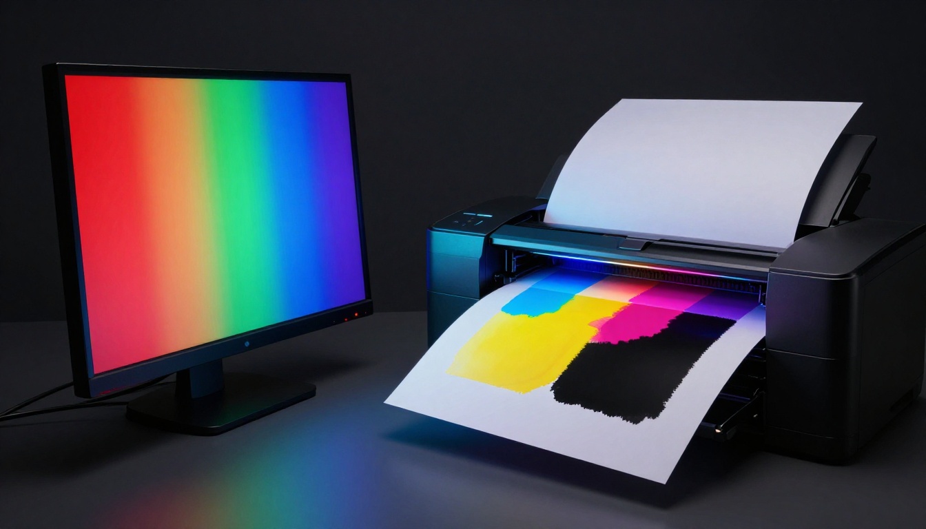
You pour hours into a vibrant design on your screen. It pops with bold reds and electric blues. Then the prints arrive, and disappointment hits: colors look flat, muddy, almost brownish. This happens because screens use RGB color profiles that glow with light, while printers rely on CMYK inks that absorb it.
RGB works great for digital views, but it clashes with print needs. Bright hues oversaturate and fade when converted wrong. You can fix this, though. Follow these steps to match color profiles and get sharp, true prints every time.
Let’s start with the basics so you see why this mix-up occurs.
Grasp the Basics: RGB for Screens, CMYK for Prints
RGB suits digital life perfectly. It mixes red, green, and blue light to create endless bright shades. Screens add light, so colors feel alive and punchy.
CMYK takes a different path for prints. Printers layer cyan, magenta, yellow, and black inks. These subtract light from white paper, so results stay realistic but less vivid.
The gap shows in everyday work. Designers love RGB for quick web previews. Yet prints demand CMYK to match ink limits.
Here’s a quick comparison to make it clear:
| Aspect | RGB (Screens) | CMYK (Prints) |
|---|---|---|
| Color Mixing | Additive (light builds color) | Subtractive (inks absorb light) |
| Gamut Size | Wide, includes neons | Narrower, realistic tones |
| Best For | Web, social, monitors | Brochures, posters, packaging |
| Common Issue | Too bright for ink | Dulls if RGB converts poorly |
This table highlights the core split. RGB expands beyond what inks handle. As a result, direct swaps lead to dull outputs.
RGB: Bright and Limitless on Your Screen
RGB starts with three lights: red, green, blue. They blend additively, so white comes from full strength. This lets you hit neon pinks or glowing greens easily.
You see it everywhere online. Websites load fast with RGB files. Emails and phone apps shine too. Designers sketch in RGB because it matches how we view screens.
However, this vibrancy tricks the eye. What glows on a monitor won’t translate to paper. Screens emit light; paper reflects it. Therefore, RGB sets false expectations for print.
CMYK: Realistic Inks That Printers Love
CMYK builds colors by subtracting light. Cyan absorbs red, magenta skips green, yellow blocks blue. Black, or K, adds depth without muddy layers of the first three.
Printers thrive on this system. It mimics real pigments like paints or dyes. You get solid blacks and even tones on brochures or packaging.
In addition, CMYK handles mass production well. Offset presses layer inks precisely. So final products match proofs closely. Still, its range stays smaller than RGB’s glow.
The Big Clash: Why RGB Fails in Print
Send RGB to a printer, and trouble brews. Extra-bright colors fall outside CMYK’s reach. A fiery orange might turn rusty brown. Pure blue often grays out.
For example, think of neon signs versus poster paints. Lights dazzle at night. Paints dry flat in daylight. Similarly, RGB’s extras vanish in ink.
This clash wastes time and money. Clients reject dull proofs. You rework files in a rush. Next, you’ll learn to spot these issues early.
Spot Muddy Print Traps Before They Ruin Your Project
Muddy prints sneak up fast. One wrong profile, and your project flops. Catch signs early to save headaches.
Common errors include skipping conversions or picking mismatched profiles. Home tests or client mocks often reveal the truth first. Therefore, build a habit of double-checks.
Software like Photoshop flags problems too. Use previews to simulate print. This shifts your mindset from screen to paper.
Warning Signs Your Colors Will Muddle Up
Look for flat hues first. Vibrant reds lose punch and brown out. Blacks turn grayish because pure RGB black needs all channels maxed.
Contrast drops next. Highlights blend into shadows. Oversaturated darks print weak or patchy.
Designers share stories like this often. A bright logo faded on business cards. Event posters lost their pop after proofs. These cues scream profile mismatch.
- Brownish shifts: Bright colors dull to mud.
- Gray blacks: No true depth in dark areas.
- Faded vibrancy: Neons wash out completely.
Spot these, and act fast.
Fast Software Checks to Catch Problems Early
Open your file in Photoshop or Illustrator. Go to View and select Proof Colors. Pick a CMYK setup like U.S. Web Coated.
Warnings pop if colors clip. Gamut check highlights out-of-range areas in yellow or such. Bridge sorts files by profile too.
Meanwhile, free viewers like Chrome handle basic previews. Upload and toggle modes. Problems show right away. These steps take seconds but prevent disasters.
Master Color Conversion: Steps to Crisp Prints Every Time
Conversion sounds scary, but it’s straightforward. Start in RGB for design freedom. Then switch to CMYK carefully. Follow these steps for reliable results.
Work in layers: assign profiles first, convert second, proof last. Software handles most math. You guide the process.
Pick profiles that match your printer. Common ones include sRGB for start and SWOP for output. Always embed them to avoid shifts.
- Open in RGB: Design with sRGB assigned (Edit > Assign Profile).
- Choose target CMYK: Select printer specs, like US Web Coated SWOP v2.
- Convert safely: Use Edit > Convert to Profile. Pick Relative Colorimetric.
- Soft proof: View > Proof Setup to simulate print.
- Adjust and save: Tweak as needed, export PDF/X.
This workflow keeps colors true. Vectors in Illustrator follow similar paths.
Pick and Assign the Right Starting Profile
Begin with sRGB for RGB work. It’s standard for web and most monitors. Assign it via menu to avoid assumptions.
For CMYK, match your printer. Ask for their profile, often FOGRA39 or GRACoL. Embed it so others see your intent.
Why assign first? It sets baselines without changing pixels yet. Then conversions stay predictable.
Convert RGB to CMYK Smoothly Without Drama
Skip Image > Mode > CMYK. It clips colors harshly. Instead, Convert to Profile preserves more detail.
Choose Relative Colorimetric for most jobs. It maps whites to whites and clips minimally. Perceptual works for photos with big shifts.
Before and after previews show gains. Reds hold saturation. Blues stay crisp. Practice on duplicates to build confidence.
Proof and Adjust for Print Perfection
Soft proofing simulates ink on paper. Set up under View. Cycle presets to match your stock.
Out-of-gamut areas glow. Dial back saturation or brightness there. Add curves for punch if needed.
Print a cheap test on similar paper. Compare to screen. Tweak until they align. This closes the loop.
Save and Hand Off Files That Print Right
Export as PDF/X-1a. It embeds profiles and flats colors. Avoid layered PSDs for printers.
Include notes: “Convert to your CMYK profile if needed.” Send high-res at 300 DPI. Files arrive ready to roll.
Pro Tips and Tools to Keep Prints Looking Sharp
Small habits make big differences. Calibrate often and talk to printers. These extras lock in quality.
Free tools help too. Online gamut checkers flag issues quick. Apps like Adobe Color aid planning.
Future files use PDF/X-4 for spots. Partner right, and prints wow every time.
Calibrate Your Setup for Accurate Colors
Monitors drift over time. Use built-in tools or a $100 puck like Colormunki. Run monthly.
Set to 6500K and 120 cd/m2. This matches print whites. Colors stay honest from design to output.
Team Up with Printers for Foolproof Results
Ask key questions upfront. “What’s your CMYK profile?” “Can you share a test file?”
Request contract proofs. Match their stock for trials. Shared profiles cut errors in half.
Ready for Prints That Pop
Understand RGB’s screen glow versus CMYK’s ink reality. Convert with care using proper profiles. Always proof before final send-off.
Apply one step today, like a soft proof on your next file. You’ll notice sharper results fast.
Share your muddy print stories in comments. What fixed it for you? Subscribe for more design fixes, and grab our color checklist below.
Your brand deserves prints that match the screen promise. Get it right, and clients notice.