Ever drawn a straight line in a digital app only to watch it wobble like a drunk snake? You’re not alone. Many new artists fight uneven strokes and blotchy colors because they miss two key tools: pressure sensitivity and flow settings.
Pressure sensitivity lets your stylus pressure control line thickness and opacity. Light taps make thin, faint marks. Firm pushes create bold, solid ones. Flow settings decide how fast color builds up with each pass. Master these, and your art shifts from stiff to natural, like a real pencil on paper.
You’ll save time on sketches and get pro-level effects fast. This guide covers what they do, how to set them up in Photoshop, Procreate, or on Wacom tablets, and fixes for common hiccups. Ready to make your lines flow effortlessly?
What Pressure Sensitivity Really Does for Your Drawings
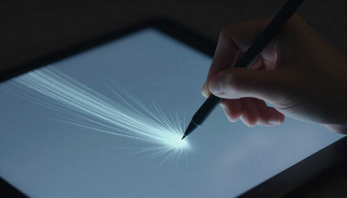
Pressure sensitivity turns your stylus into a smart brush. You press lightly for skinny lines. You push harder for thicker ones. It handles opacity too, so faint touches stay sheer while strong ones go solid.
This setup copies real-world tools. Think of a pencil on paper. Soft grip gives light sketches. Full grip lays down dark leads. No more hunting menus mid-stroke. Your hand leads the way.
Most tablets need a pressure-sensitive stylus to work. Devices like Wacom Intuos or iPad with Apple Pencil shine here. They read your force and adjust on the fly. Draw a flower stem. Start light at the tip for taper. Press firm at the base for width. It looks alive because it varies naturally.
Beginners grab this feature quick. It boosts speed and feel. You focus on ideas, not tools.
The Science Behind Pressure Levels
Tablets measure pressure in levels, like 2048 or 8192. Higher numbers mean smoother shifts. Low levels step in chunks, like stairs. High ones glide like a ramp.
For example, 2048 levels suit basic sketches. They respond well enough. But 8192 gives fine control for portraits. Subtle fades appear without jumps.
Apps show this as a curve graph. The line maps input force to output size. Default works fine at first. Tweak it later for your grip. Light-handed folks raise the curve’s start. Heavy pressers flatten the peak.
Start simple. Use defaults. Draw lines at different speeds. Adjust if light feels weak or hard stays thin.
Why It Beats Fixed Brush Sizes Every Time
Fixed sizes lock you in place. One stroke width rules all. Pressure changes that. You vary on demand.
Picture quick sketches. Pressure lets lines thicken for emphasis. Details stay precise with taps. Calligraphy flows bold to fine without swaps.
It saves time too. No brush changes mid-flow. Creativity surges because your hand directs everything.
Test it now. Grab a blank canvas. Pick a round brush. Stroke light to heavy. Watch thickness grow. Fixed sizes can’t match that freedom.
Flow Settings: Build Color Layers Without the Mess
Flow controls paint release per stroke. Low flow drips color slowly. High flow sprays it on thick. Pass the brush once, and see the difference.
Unlike opacity, which sets max transparency, flow builds over strokes. Multiple passes stack color. It’s like watering plants. Gentle drizzle layers soft. Hose blast covers fast.
Use high flow for solid fills. Base colors snap in place. Low flow suits blends. Shades merge smooth without mud.
Apps like Photoshop or Clip Studio Paint this in brush panels. Set it low for airbrush effects. Crank it for inks. Experiment avoids over-saturated blobs.
Flow vs Opacity: Know When to Use Each
Newbies mix these up often. Opacity caps stroke see-through level. Flow paces the add-on.
Here’s a quick breakdown:
| Setting | What It Does | Best For |
|---|---|---|
| Opacity | Max transparency per stroke | Overall fade control |
| Flow | Color build per pass | Layering and blending |
Full opacity with low flow shades subtle. It stacks slow. Low opacity high flow covers quick but stays sheer.
Mix them right, and frustration drops. Test on a color block. Stroke back and forth. See buildup form.
Pick the Right Flow for Your Art Style
Match flow to your look. Watercolor dreams low flow around 20%. Colors soak in gentle. Inks need 100% for crisp edges.
Realism in digital painting? Start at 50%. Build skin tones pass by pass. It mimics oil layers.
Adjust while you work. Stroke a gradient. Too fast? Dial flow down. Blends stay clean. Your style guides the number.
Easy Steps to Set Up Pressure and Flow on Your Gear
Start with basics. Update tablet drivers from the maker’s site. Restart your computer. Calibrate in the control panel. This ensures clean reads.
In apps, find brush settings. Photoshop has a top bar panel. Procreate uses per-brush sliders. Enable pressure for size and opacity. Set flow next to it.
For Wacom, open the tablet app. Test strokes in a preview window. iPad users tap Apple Pencil settings in iOS. Hover distance matters too.
Pick sample brushes. Round ones show changes best. Stroke varying pressure. Flow test needs loops over color.
Desktop setups differ from mobile. Tablets pair with PCs for power. iPads shine portable but cap levels lower.
Customize Curves for Your Perfect Feel
Curve editors live in tablet software or apps. Drag points on the graph. Raise the left for light-touch response. Pull down the right for less bold max.
Presets help. “Soft” suits delicate work. “Firm” fits heavy lines. Pick one close to your style.
Test smart. Draw slow lines. Vary from tap to push. If it lags, steepen the curve. Practice ten minutes daily.
Quick Fixes for Tablets Not Responding
Stylus skips? Check battery first. Recharge or swap nibs. Update drivers next. Old ones glitch.
Apps freeze pressure? Restart them. Unlock layers too. Some modes block it.
Reset defaults if stuck. Hold shift during launch in Photoshop. Your gear revives fast.
Top Mistakes Beginners Make and How to Dodge Them
Calibration skips top the list. Lines jitter without it. Fix by running the setup wizard each session.
Crank flow too high next. Blobs ruin blends. Start at 40%. Build up slow.
Mismatch sensitivity causes overshoot. Light presses go thick. Tweak curves down.
Ignore tilt if your stylus has it. It adds shading. Enable in settings.
Shaky hands amplify issues. Use forearm strokes. Stabilizers in apps smooth the rest.
Practice beats all. Do five-minute drills daily. Draw circles, lines, fills.
Overcoming Jittery Lines and Uneven Buildup
Low pressure levels spark jitter. Cheap tablets step rough. Upgrade if needed.
Stabilizer off worsens shakes. Turn it on in brush options. Paths even out.
Flow jumps cause buildup spikes. Lower it dynamic. Stroke light for control.
Wrist fatigue builds errors. Shift to arm motion. Desk height helps. Lines steady up.
Your strokes smooth with these tweaks.
Pressure sensitivity brings dynamic lines to life. Flow lets you layer colors clean. Grab your tablet now. Test one setting today.
Share your before-and-after art in the comments. What app do you use? Experiment, and watch your skills soar. Your next masterpiece starts with the right stroke.